Land Rover Defender – HMI Launch
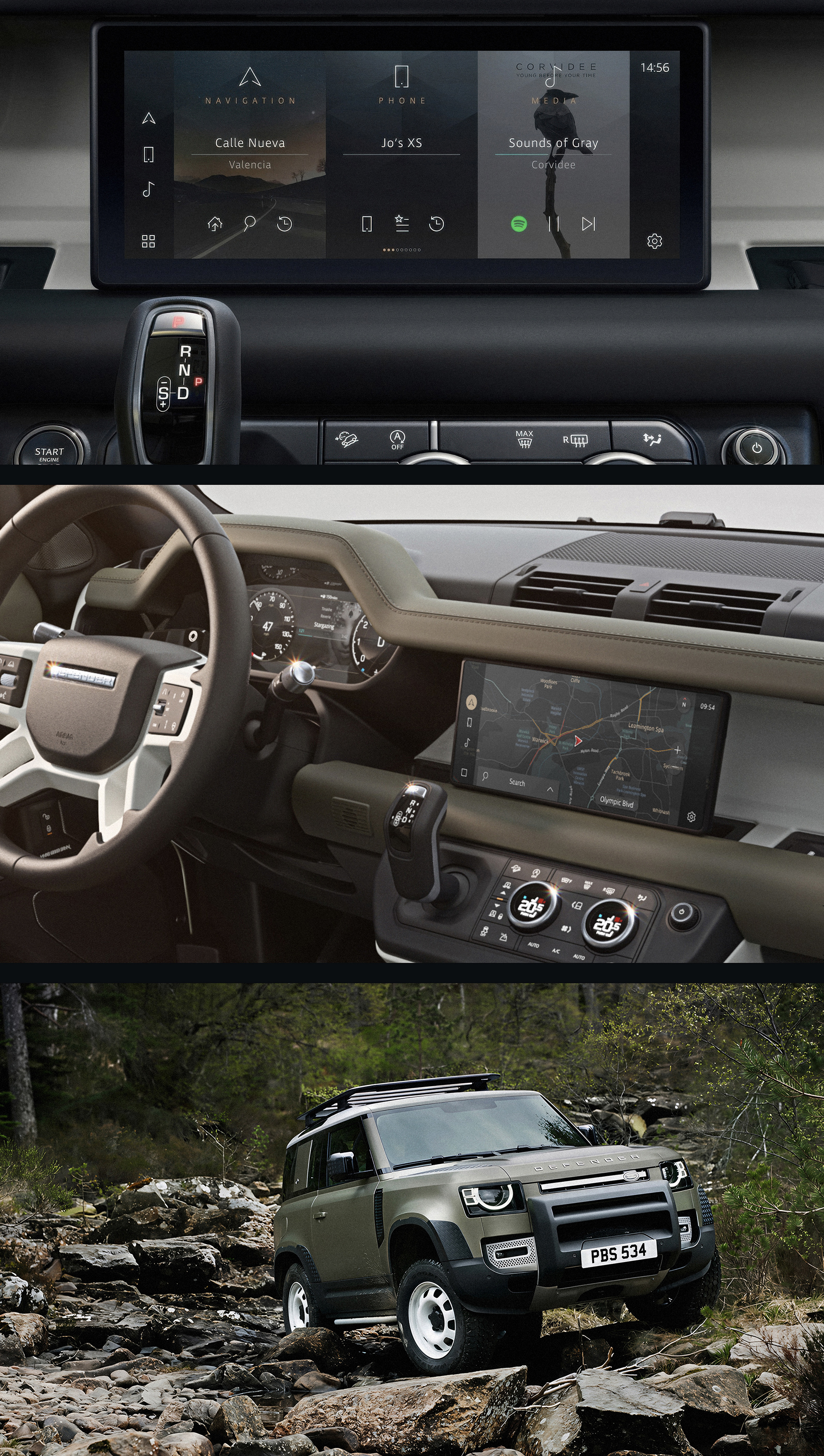
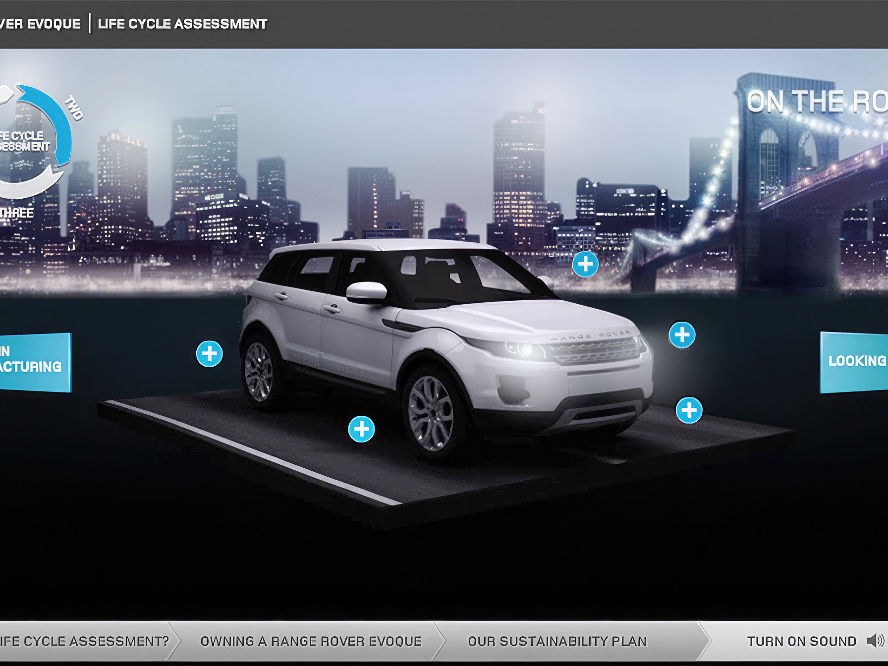
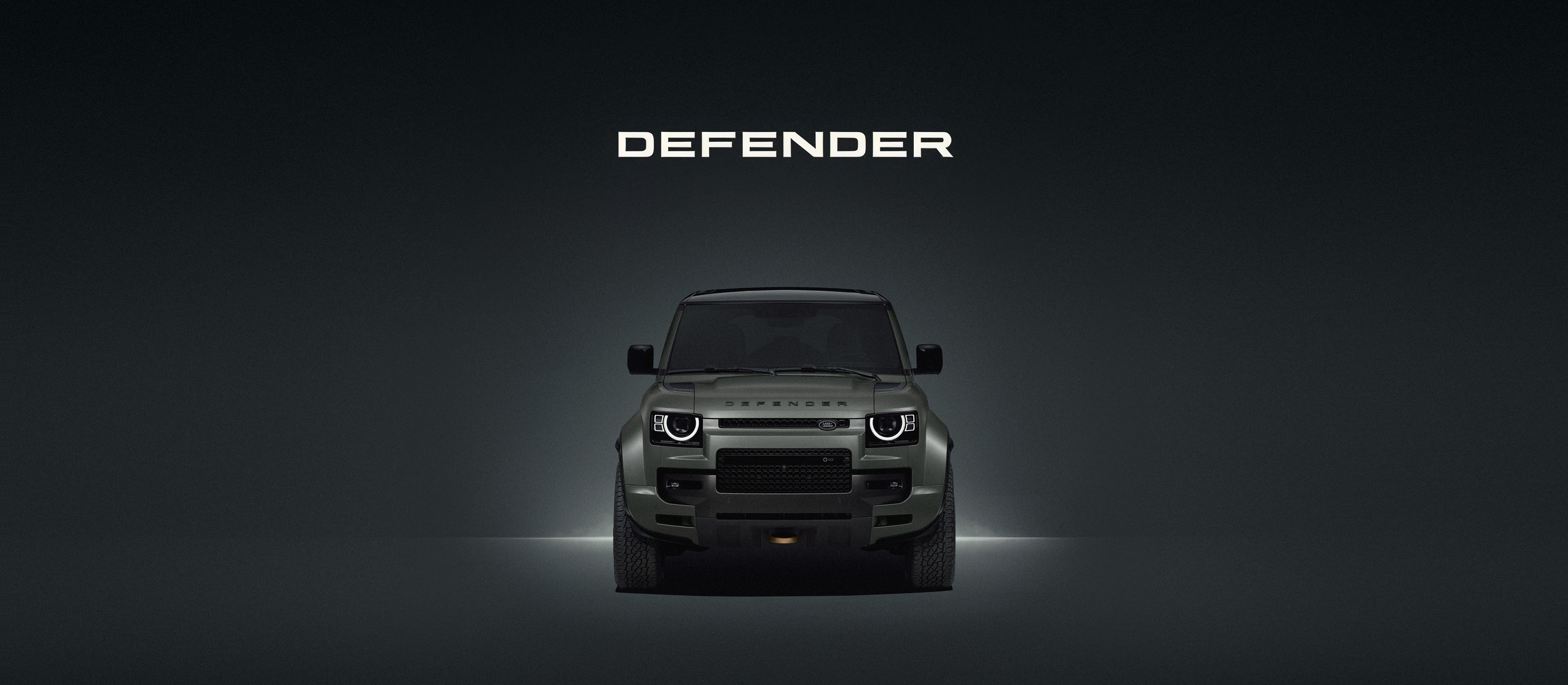
These are some early launch screenshots from the new Defender HMI, my first in-house automotive HMI project at Jaguar Land Rover.
From day one, standing beside the full-scale clay models and sitting inside the interior buck, it was clear to me that the new Defender was going to be a success. It was bold, iconic and instantly recognisable. Distinctiveness is an important ingredient, particularly at a time when so many modern vehicles are beginning to look alike.
Around the same period, I test-drove a Tesla Model X as part of JLR’s research and development work. It immediately felt like the iPhone moment for the car industry: a computer first, with the vehicle wrapped around it. That software-led, user-first thinking had a profound impact on how I approached automotive HMI.
From day one, standing beside the full-scale clay models and sitting inside the interior buck, it was clear to me that the new Defender was going to be a success. It was bold, iconic and instantly recognisable. Distinctiveness is an important ingredient, particularly at a time when so many modern vehicles are beginning to look alike.
Around the same period, I test-drove a Tesla Model X as part of JLR’s research and development work. It immediately felt like the iPhone moment for the car industry: a computer first, with the vehicle wrapped around it. That software-led, user-first thinking had a profound impact on how I approached automotive HMI.
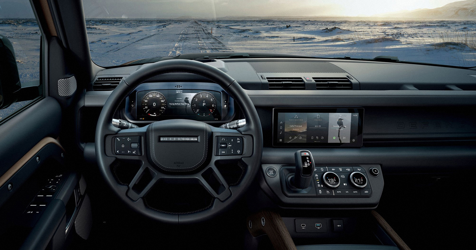
On the Defender, I worked across the instrument cluster and the new HMI system as part of a large multidisciplinary team. JLR’s traditional OEM structure was a shift for me, but I pushed for a cleaner and more logical system. I drew on smart device and console UI principles, aiming to create consistent layouts, predictable interactions and a stable navigation structure.
The goal was to move away from treating every feature as its own bespoke page, often buried within deep menus. It should go without saying that menus shouldn’t jump around between screens. Their structure and behaviour should remain clear, stable and predictable.
I never did manage to kill off those kettle power icons, though. They had a habit of creeping in everywhere.
The goal was to move away from treating every feature as its own bespoke page, often buried within deep menus. It should go without saying that menus shouldn’t jump around between screens. Their structure and behaviour should remain clear, stable and predictable.
I never did manage to kill off those kettle power icons, though. They had a habit of creeping in everywhere.