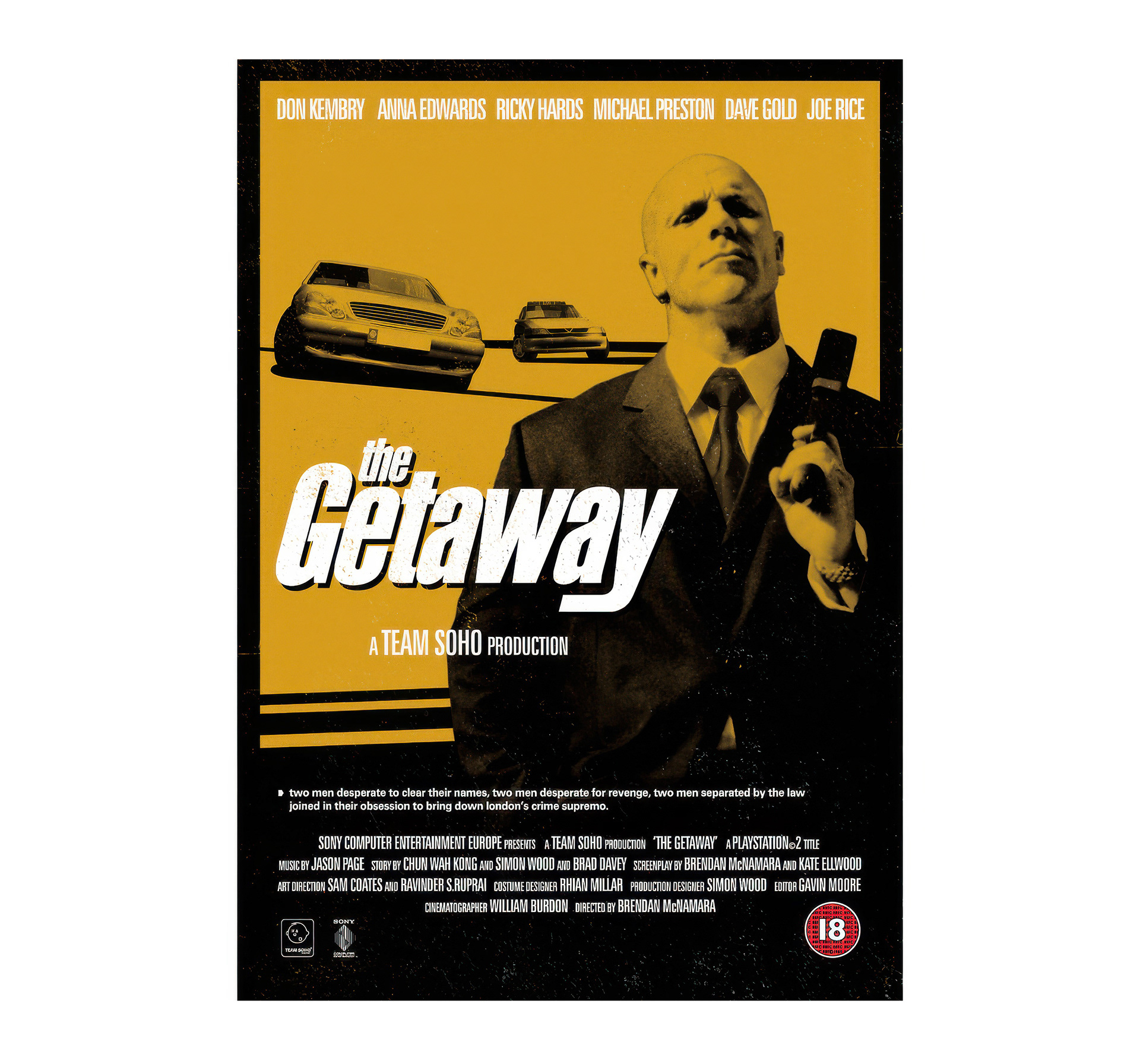
A few years after finishing college, I found myself working at Sony’s Soho studio in London, one of their leading first-party teams at the time. As part of the interview process, candidates were asked to create two UI front-end concepts, effectively art tests, for The Getaway and This Is Football, both in development for the upcoming PlayStation 2.
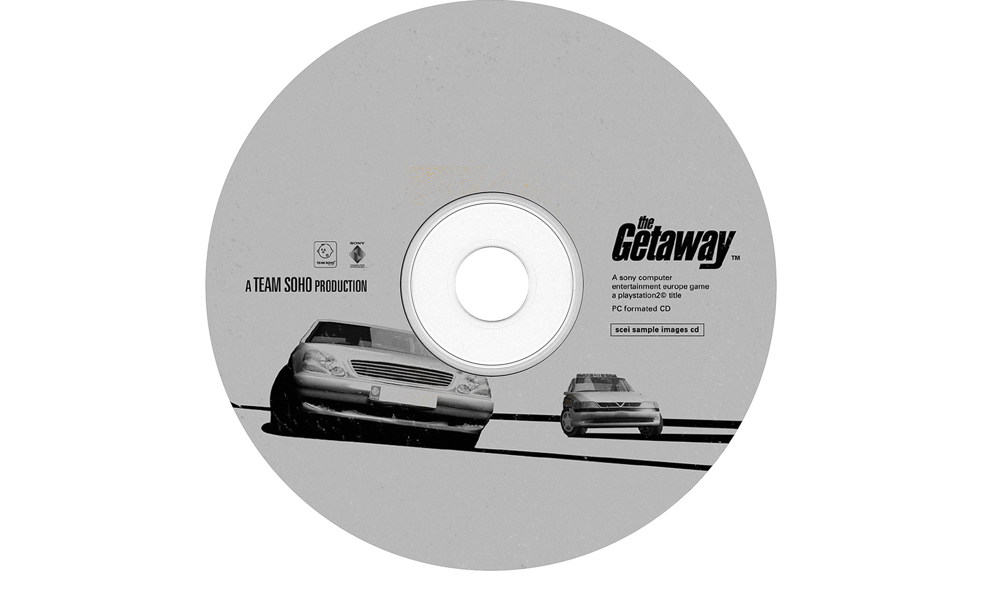
I built two animated prototypes in Macromedia Director. For The Getaway, I designed a custom logo using a typeface called Alternative, a free font that came with a typography magazine from my days at Design One, the agency I had worked at previously. To my surprise, that logo was later adopted as the final game logo, with Andy Hamilton applying a few tweaks after I left, giving it a more distressed finish.
The Getaway was positioned as a cinematic, open-world action game inspired by British gangster films such as Get Carter and Snatch. My design direction drew heavily from mid-century poster art, particularly 1950s and 60s compositions influenced by the 1969 Easy Rider campaign.
These are some of the original concepts and explorations from my time at the Soho studio, where we were defining both the visual identity and the tone for one of Sony’s most ambitious projects of that era..