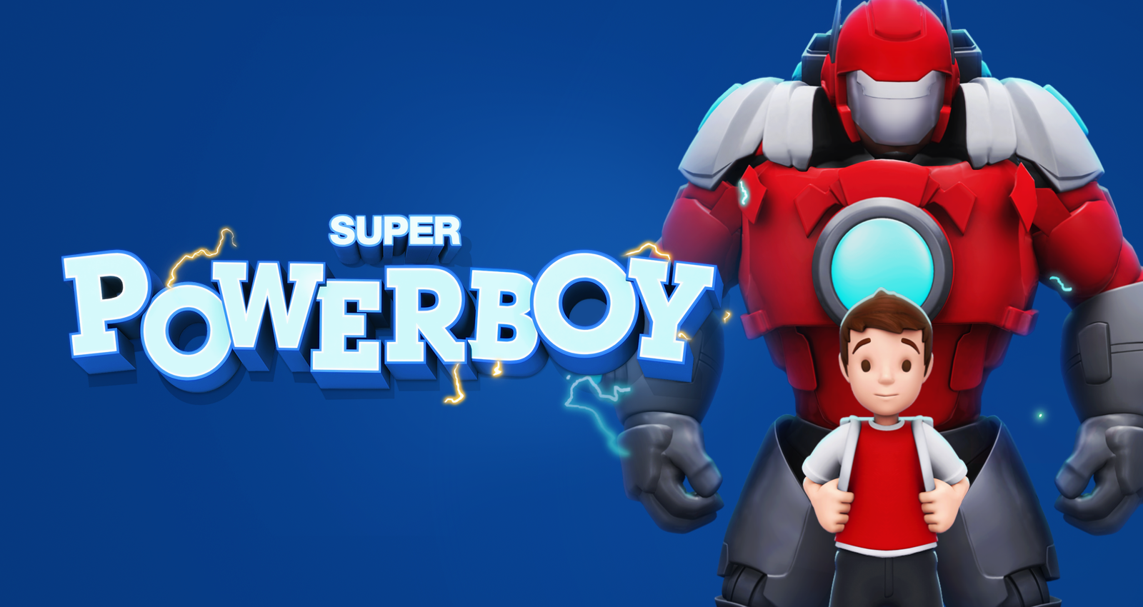
Meet Super PowerBoy, defender of the planet, destroyer of aliens, and my premium platformer IP. I created the IP from scratch, designing the characters, building the world, and shaping the gameplay systems. This was a passion project where I invested heavily in both time and resources, overseeing the full creative direction.
The game made its mark early, placing second at Pocket Gamer’s Very Big Indie Pitch at PGC London 2016. On release, it received resounding critical acclaim. Pocket Gamer gave it 9/10, calling it “a gorgeous looking, fun as all hell platformer that mixes the modern and the old fashioned wonderfully.”
At the core of the game was a strong sense of progression. It began light, whimsical, and simple, but with each stage players unlocked new abilities, faced tougher enemies, and explored richer environments. The tone built steadily, evolving into a more epic experience that carried the player toward climactic encounters and a heightened sense of scale.
From concept through to execution, Super PowerBoy was about proving that a small, independent project could compete at the highest standard of mobile gaming.
Art Direction
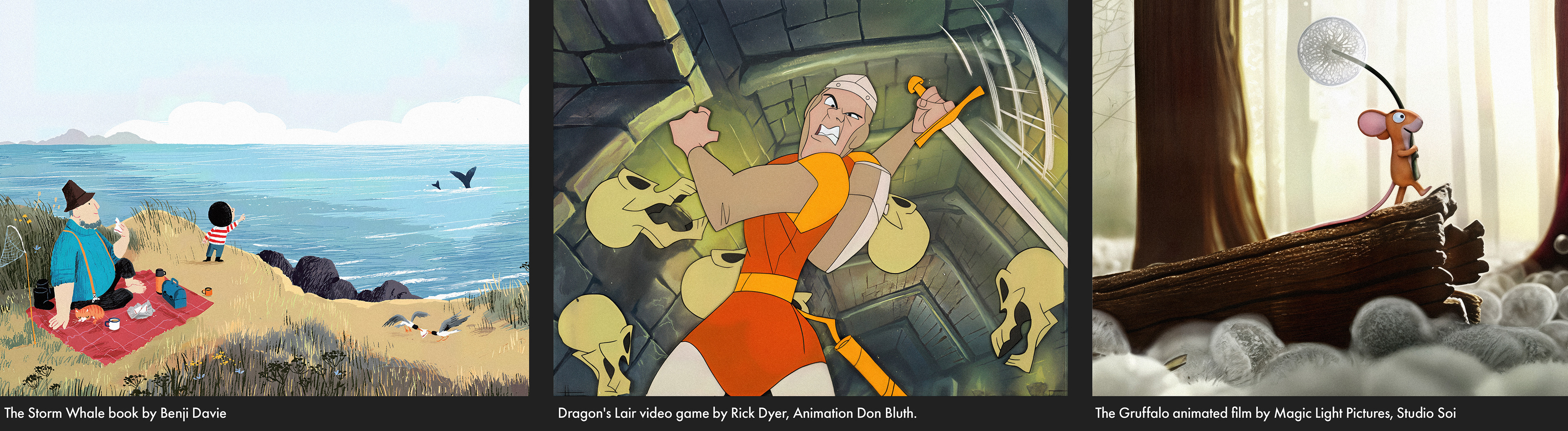
For the art direction and tone, I drew from a mix of influences. It was a children’s game, but I wanted an artistic edge that spoke to a wider audience. Inspirations included the charm of modern children’s books like The Storm Whale and A Bit Lost, the classic appeal of Don Bluth animation, and the polish of Pixar, Big Hero 6, and BBC features like The Gruffalo.
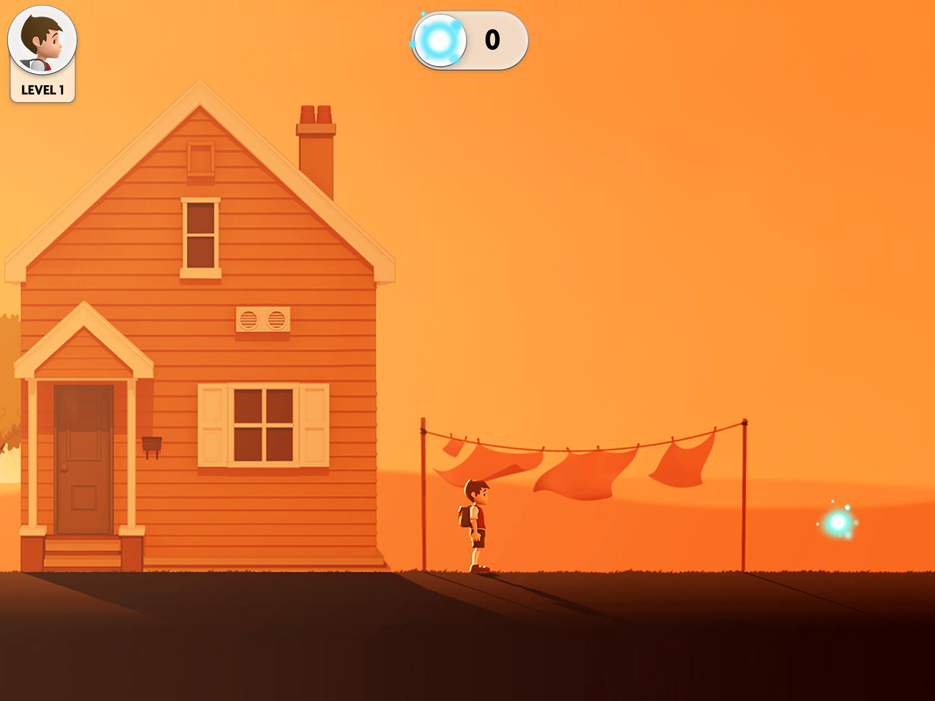
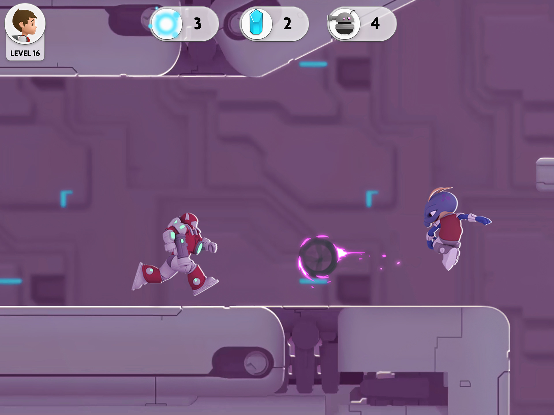
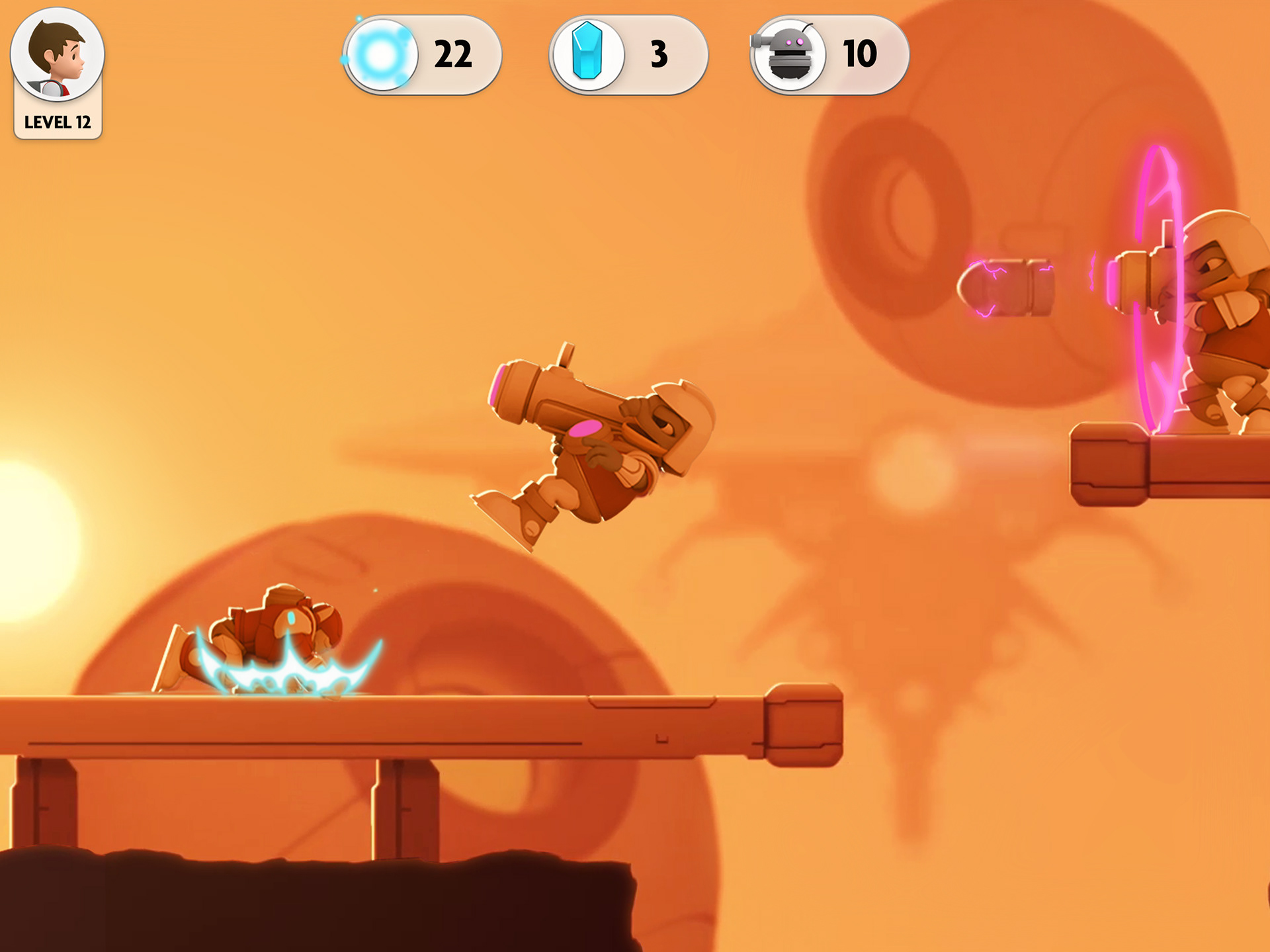
The game began with sweeping countryside environments that felt open and innocent, but as the boy grew more powerful the world shifted. Later stages took place across robotic, alien ship landscapes that had to be traversed. I liked the contrast this created and the sense of player journey. By the end, the boy had become a monster in many ways, and that transformation was mirrored in the art, with level style, visual density, and atmosphere building alongside the gameplay intensity.
The game began with sweeping countryside environments that felt open and innocent, but as the boy grew more powerful the world shifted. Later stages took place across robotic, alien ship landscapes that had to be traversed. I liked the contrast this created and the sense of player journey. By the end, the boy had become a monster in many ways, and that transformation was mirrored in the art, with level style, visual density, and atmosphere building alongside the gameplay intensity.
Game and Level Design
In terms of game and level design, I followed my usual method of building things up slowly. I started simple, making the core movement feel responsive and satisfying before adding mechanics like jumping and new powers. I roughed out ideas first, then refined them into a playable demo in the editor. I learned to trust my gut with these things - I had been playing games long enough to know what felt right.
For level design, difficulty, and the progression of power-ups across the game, I worked out a rough plan and then built levels around each new ability, very much in the Nintendo style: “Here’s a new power, now go play with it and master it.” We built a robust, modular level editor, which meant I didn’t waste too much time fighting the tools (though, to be fair, there was some of that - it came with the territory).
We also had the ability to adapt the camera through each level, something most players never noticed, but it made a difference. When a big traversal or drop was coming up, I slowly zoomed the camera out so the player could see what was ahead and react fairly.
For intensity, I built most levels with pacing in mind, taking cues from the golden ratio. Sometimes I threw a sequence of enemies and challenges at the player, then gave them a break with some collectibles as a reward. On average, each level took me about two days to block out and a day to polish, though the later, longer levels took more time.
We also mapped the musical score to match the intended peaks and valleys of intensity across each stage. It was a lot of work for one person, but it was rewarding.
Building a Unique World
We chose pre-rendered sprites because phones in 2015/16 were limited, and we had to support older devices still in circulation. Real-time models wouldn’t have delivered the clean, smooth edges we wanted. With the right art style, pre-rendered sprites gave the game a stylish look unlike anything else on the market.
Grading (LUT)
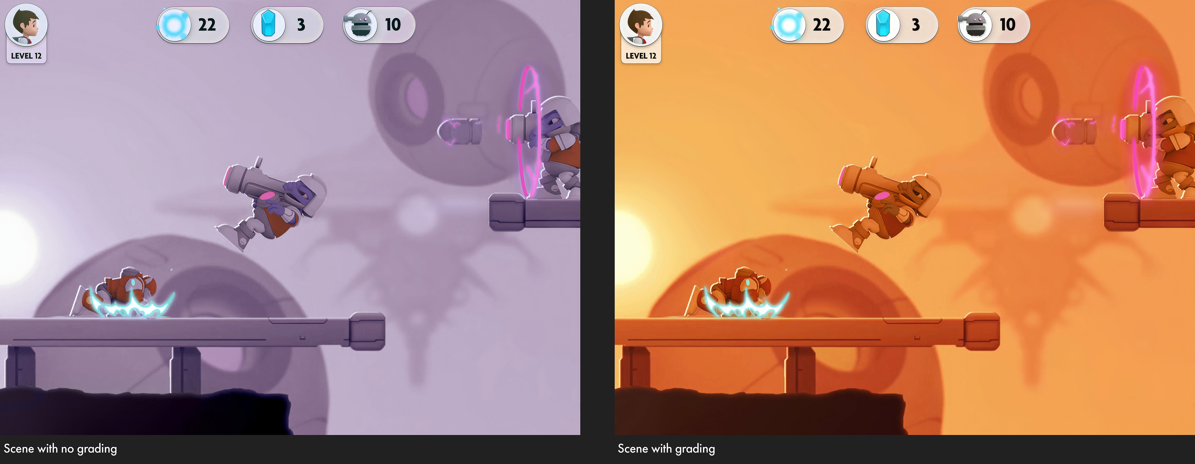
I created a LUT system to recolour stages and simulate different times of day. It set mood and atmosphere while making levels feel distinct without requiring new assets. Neutral base colours kept everything cohesive when graded. Day stages used warmer skies, night stages shifted to deep blues and subtle stars, and dusk or dawn proved especially effective. As shown below, the left image was without grading, while the right showed the morning LUT applied, adding warm orange hues.
Good and Bad Colours
We used colour coding to guide players intuitively. Power-ups and collectibles were cyan blue, while enemies and hazards leaned toward pink and purple. The LUTs were balanced so these key colours stayed readable across different stages. If grading was pushed too far it risked banding, but handled carefully it created a strong and consistent visual language.
Dynamic Sun Rays
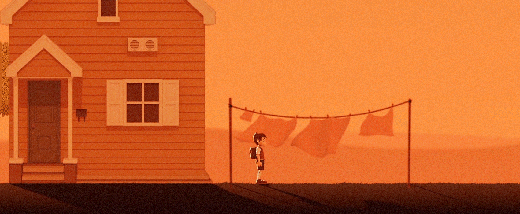
We also added a blurred glowing circle between the game artwork and the LUT, fading it in and out as the sun moved across the screen and behind scenery. It created a fake but convincing effect of real-time light that added atmosphere and depth to the environments.
Edge Lighting
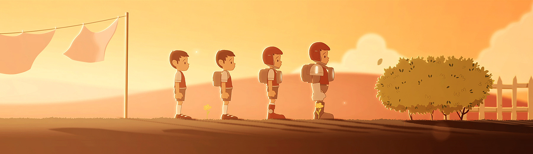
Another effect that worked well was edge lighting (as seen above. We generated a low-res normal map for each element we wanted to catch the light, then linked the directional light to the sun. This created the impression that characters and objects were being backlit as the sun moved across the scene. It also had a positive effect on gameplay and player readability, since only elements on the player’s level and available for interaction received the edge lighting.
We used colour coding to guide players intuitively. Power-ups and collectibles were cyan blue, while enemies and hazards leaned toward pink and purple. The LUTs were balanced so these key colours stayed readable across different stages. If grading was pushed too far it risked banding, but handled carefully it created a strong and consistent visual language.
Dynamic Sun Rays
We also added a blurred glowing circle between the game artwork and the LUT, fading it in and out as the sun moved across the screen and behind scenery. It created a fake but convincing effect of real-time light that added atmosphere and depth to the environments.
Edge Lighting
Another effect that worked well was edge lighting (as seen above. We generated a low-res normal map for each element we wanted to catch the light, then linked the directional light to the sun. This created the impression that characters and objects were being backlit as the sun moved across the scene. It also had a positive effect on gameplay and player readability, since only elements on the player’s level and available for interaction received the edge lighting.
Shadows
Ref. above. The final touch that really sold the scene was the shadows. When the player stood on the ground rather than a floating platform, we added shadows that looked as if they were blocking sunlight. They weren’t real, just projected at a convincing angle, but the illusion worked. The animation helped too: the boy’s movement cast a natural-looking shadow, and even the washing had its own. It was often the small, technically simple details that sold the scene and brought it to life.
Ref. above. The final touch that really sold the scene was the shadows. When the player stood on the ground rather than a floating platform, we added shadows that looked as if they were blocking sunlight. They weren’t real, just projected at a convincing angle, but the illusion worked. The animation helped too: the boy’s movement cast a natural-looking shadow, and even the washing had its own. It was often the small, technically simple details that sold the scene and brought it to life.
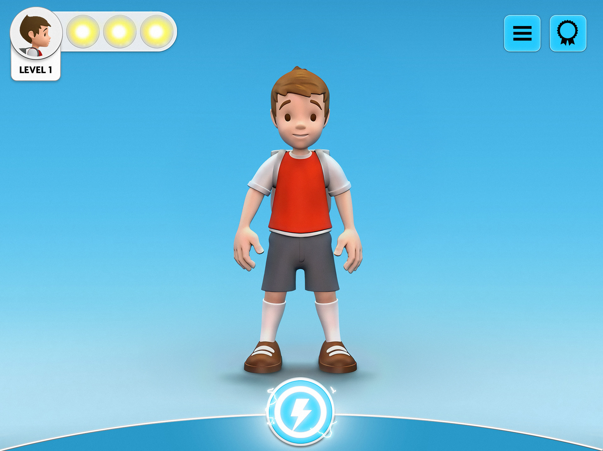
Character Design
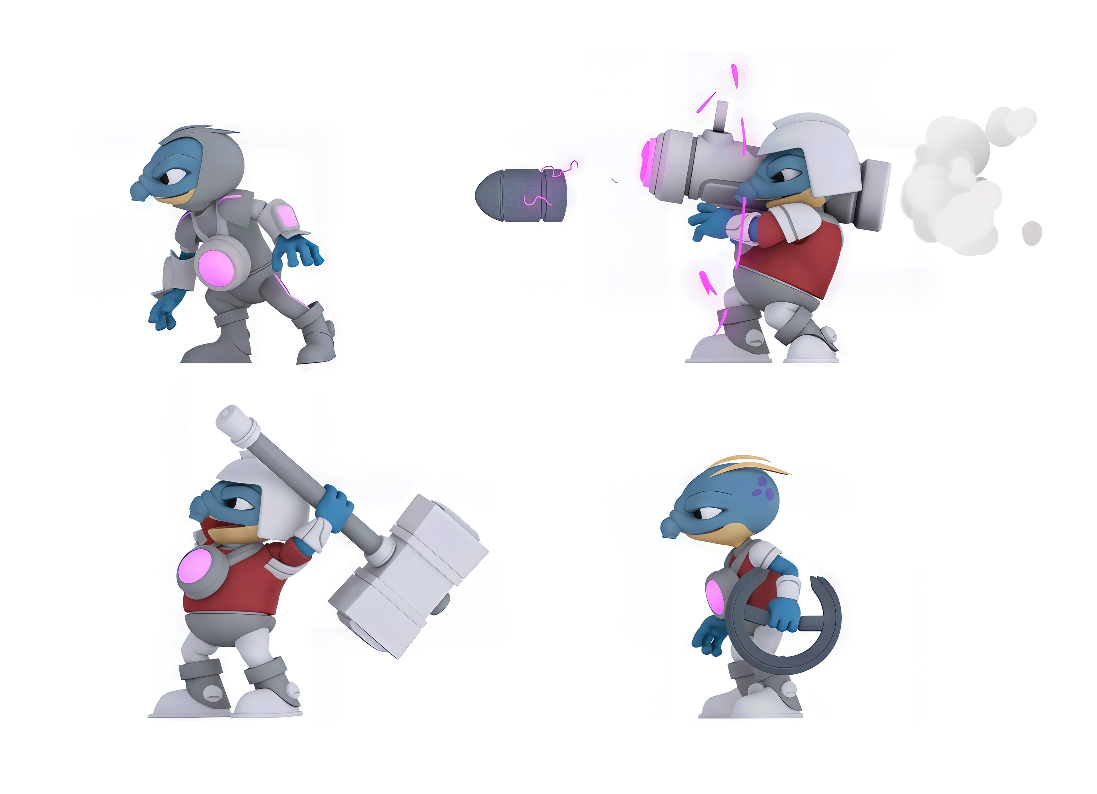
Ref. above. I conceptualised all the characters, inspired by the style of Don Bluth. Many of the enemies also draw from Friz Freleng’s Blue Aardvark and Cyril Sneer from The Raccoons. The enemies share a clear visual language and personality, which I saw as essential.
Animation
Animation
For animation, I aimed for a smooth, deliberate, slightly exaggerated style inspired by Disney classics, distinctive yet always clear and readable in gameplay. Under my direction we brought in a 2D animation specialist for the overlayed effects, which added real drama during rail grinds and enemy missile attacks.
Below are some of the characters and their animations. I’m especially fond of the “handsome brute,” an enemy armed with a shoulder-mounted missile launcher. I designed all the characters, created their move sets, and directed the animation work.
Below are some of the characters and their animations. I’m especially fond of the “handsome brute,” an enemy armed with a shoulder-mounted missile launcher. I designed all the characters, created their move sets, and directed the animation work.
Front End, UI /UX
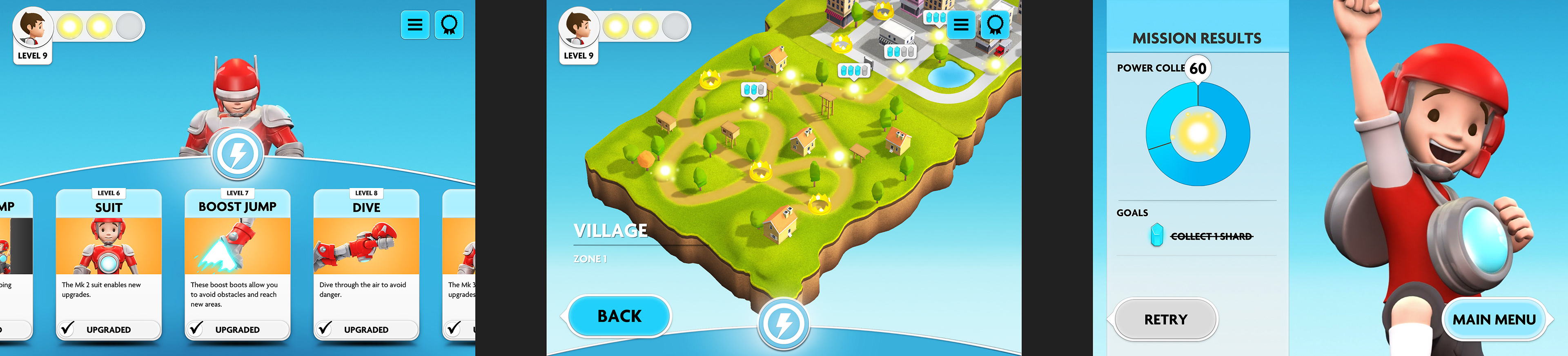
For the Front End, I aimed for a clean and straightforward UX with a simple linear flow between the character screen and stage selection. The only additional feature was a pop-up power-up menu, which presented each ability in turn while also tracking player progress. To reinforce this, the power charge icon pulsed when a new upgrade was available, and the unlocked ability sparked and bounced to draw attention. The tone of the Front End was deliberately calmer and more whimsical than the high-energy in-game experience, giving players a clear contrast between navigating menus and jumping into action.
Power & Progression
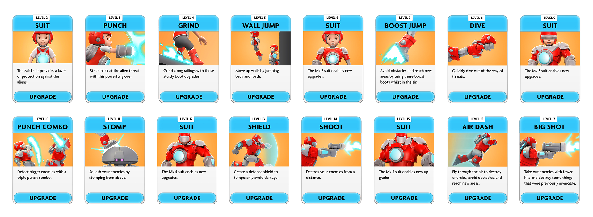
Progress in Super PowerBoy was tied to collecting power and power crystals scattered across each stage. Completing levels and gathering enough crystals unlocked new stages, zones, and Power-Ups. Each Power-Up built on or upgraded existing abilities, often adding new ways to defeat enemies or navigate changing environments. The Power cards above showed the player’s full progression.
Music
Ref. above. Another area worth highlighting is the music and sound design for Super PowerBoy. I worked closely with the brilliant Mike McLafferty, who I had previously collaborated with at Activision, so I knew he was more than up to the job. I wanted the soundtrack to mirror the player’s journey, moving from the innocent beginnings through to the epic finale. I regularly sent Mike references from films like Big Hero 6 and classic games such as Turrican II to capture the right balance of energy and emotion. The result was a score that perfectly reinforced the contrast and progression of the game, giving players a genuine sense of journey across multiple play sessions. Mike absolutely delivered.
Marketing and Branding
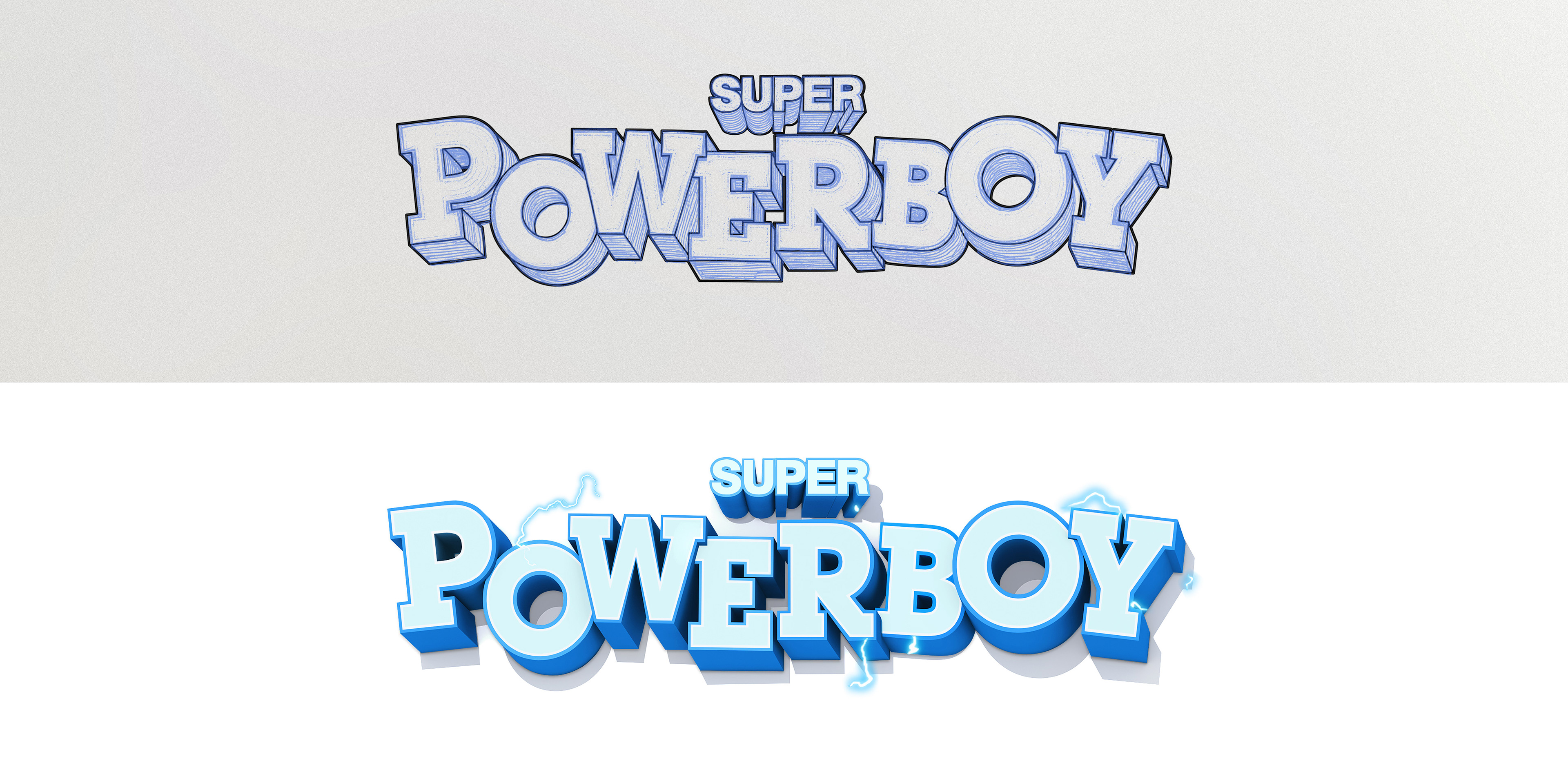
For the brand I wanted something authentic, bold, distinct, and a little familiar. The design takes cues from 80s and 90s arcade logos but is executed in a modern, high-end way so it feels like a feature-quality animation.
The logo clearly nods to the classic Paperboy logo. I don’t hide that influence, I embrace it. Building on the past works when you commit fully and give credit.
I started by hand-drawing the 3D logo in Photoshop, extruding the perspective manually as logos were once created. After locking the direction, I had a friend rebuild it in 3D, then reworked the render myself to sharpen the shading and make it pop.
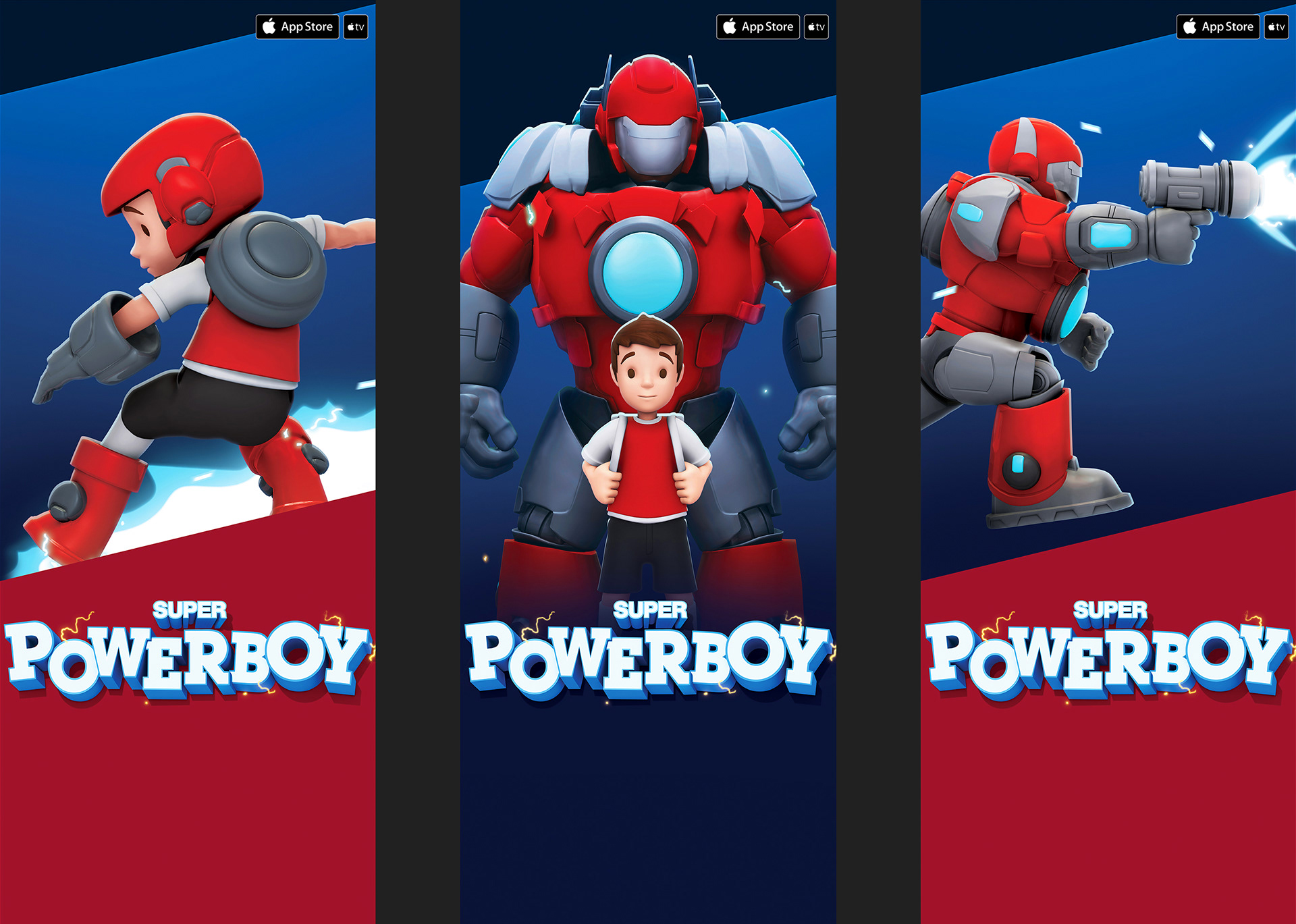
Ref. above : Independent game development is a constant balancing act: creating something with real impact while working under tight resource constraints and the ever-present risk of funds running out. Once the game is finished, the next challenge appears, marketing. Without the multi-million budgets of big studios, success depends on making the absolute most of the assets, time, and tools at hand. For our promotional material, we revisited the original in-game assets and reworked them for a new purpose. The game used pre-rendered sprites (similar to Donkey Kong Country), which meant the source renders had solid foundations but weren’t built for large-scale use. They were optimised for clarity at small, in-game sizes, so much of the fine detail needed for marketing simply didn’t exist. By combining dynamic posing with updated materials, lighting adjustments, and detailed manual retouching, we transformed those assets into visuals strong enough to stand up as marketing material.
Credits
Technical Director : Niall Muldoon
Audio : Mike Mclafferty
Additional Animation : Marti Romances, Olof Storm
Audio : Mike Mclafferty
Additional Animation : Marti Romances, Olof Storm