I have been fortunate enough to work on Halo several times over the years, and I have been a fan since its debut on the original Xbox. On paper, it could easily look like a fairly generic science-fiction first-person shooter. In execution, however, Halo established an identity entirely of its own: a vast, cinematic universe with a genuine sense of history and scale.
I began collecting Halo art books after Rare contributed to Halo 3, and I later became involved in Halo 5: Guardians a few years before working on Infinite. Collecting Halo art and design books has since become a rather expensive habit.
By the time Halo Infinite came along, I was already steeped in the series’ visual language and lore, making it a perfect project for me. I was asked to create environmental graphics that would support and connect the game world. The aim was to introduce believable, functional detail that made its environments feel tangible, inhabited and purposeful, while remaining strictly within the established Halo lore and visual design bible.
Early Multiplayer Map Artwork
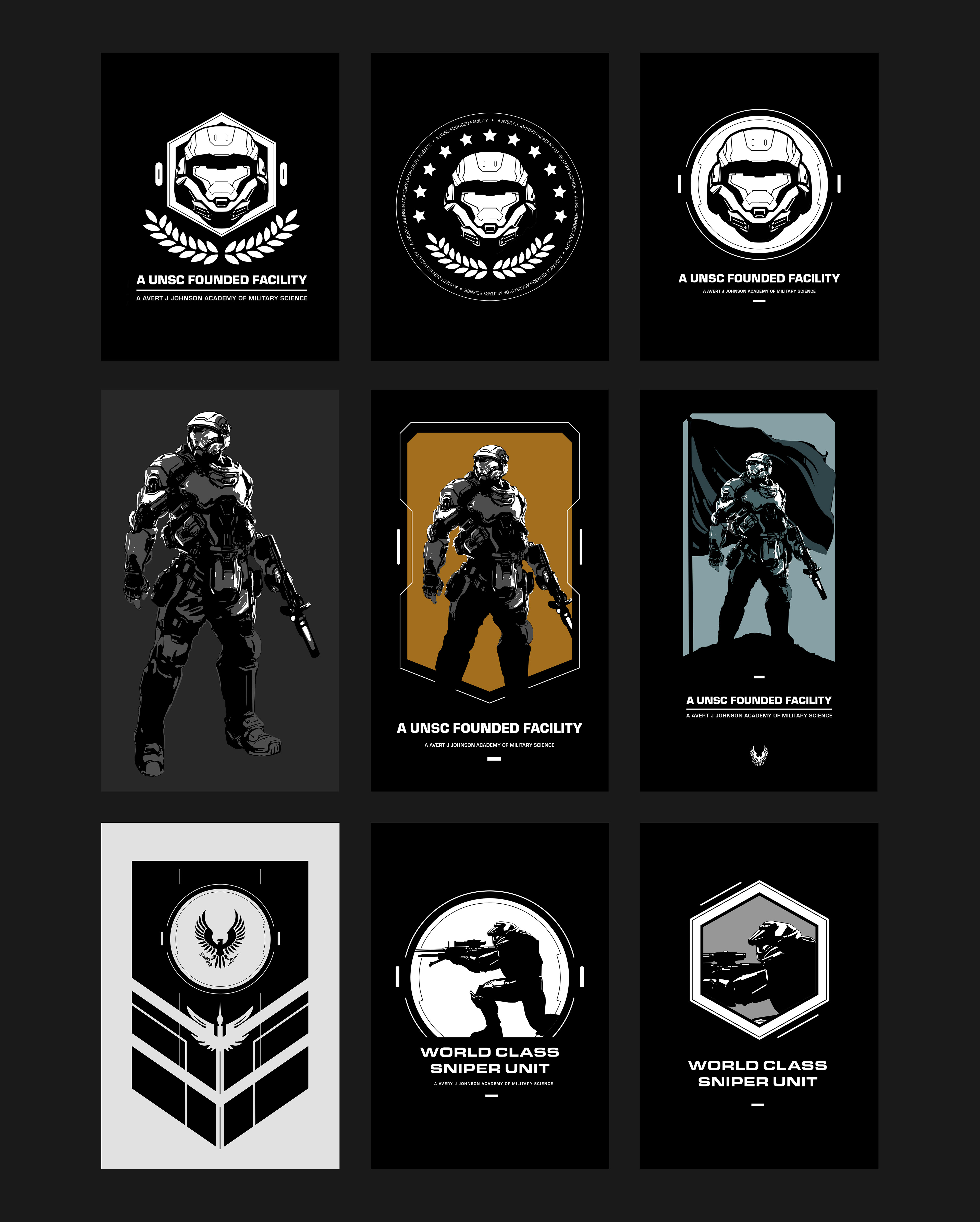
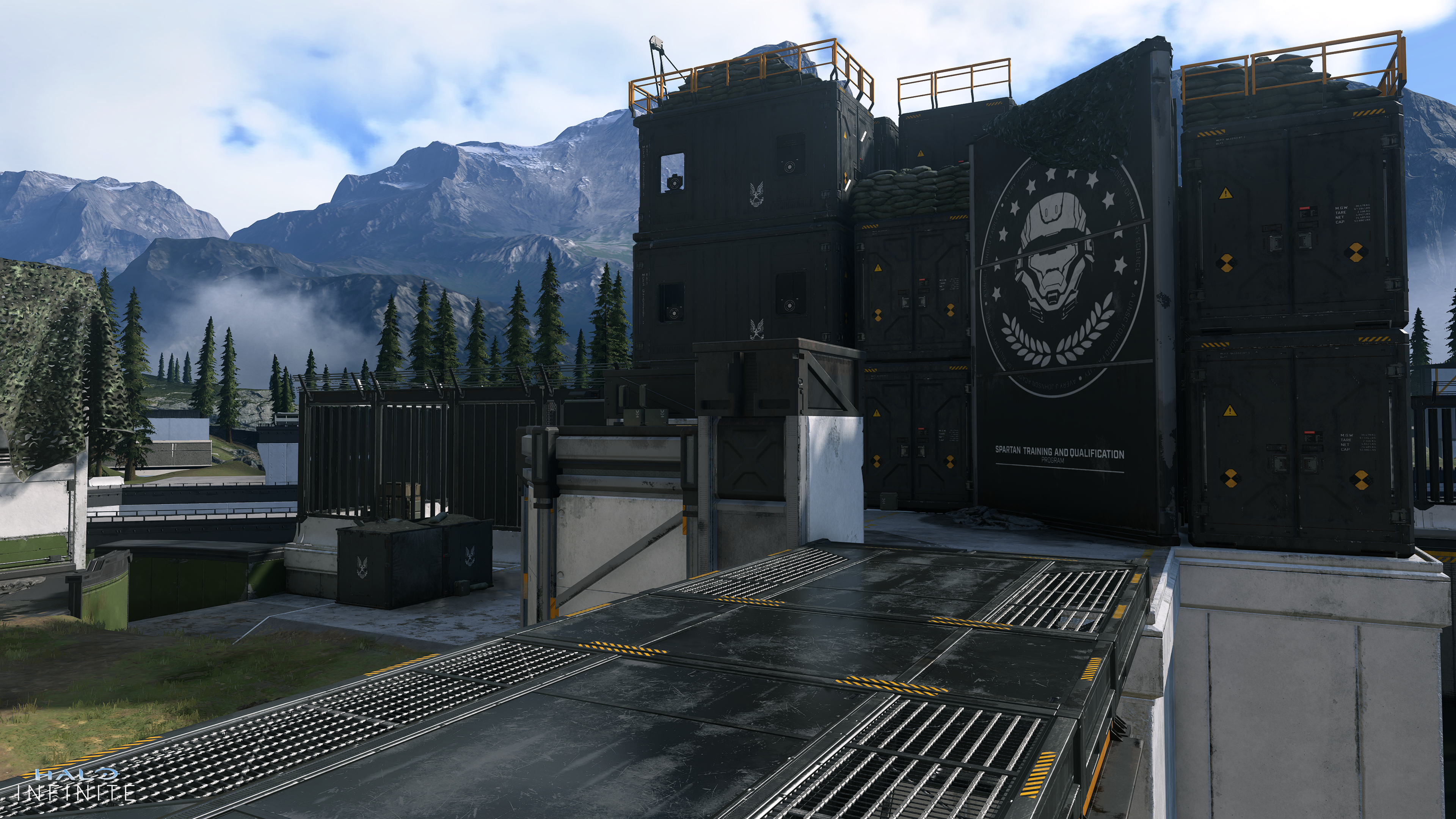
This artwork was created for Live Fire, one of the first multiplayer maps featured during the beta and set within the Spartan Academy training grounds. The brief was to make the environment feel unmistakably Halo: grounded in a recognisable reality, but clearly several steps into the future.
Scale and placement were particularly important. Some graphics extended across entire buildings, while others appeared as smaller and more subtle pieces of branding, signage and environmental detail. I focused on clean, bold forms supported by tightly controlled detail that would remain readable during fast gameplay while still holding up when viewed at close range.
Scale and placement were particularly important. Some graphics extended across entire buildings, while others appeared as smaller and more subtle pieces of branding, signage and environmental detail. I focused on clean, bold forms supported by tightly controlled detail that would remain readable during fast gameplay while still holding up when viewed at close range.
FUI, Interfaces and Physical Keypads
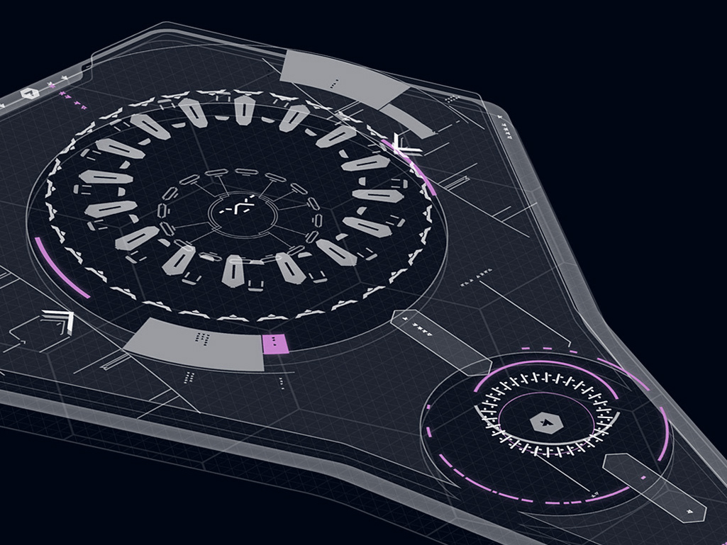
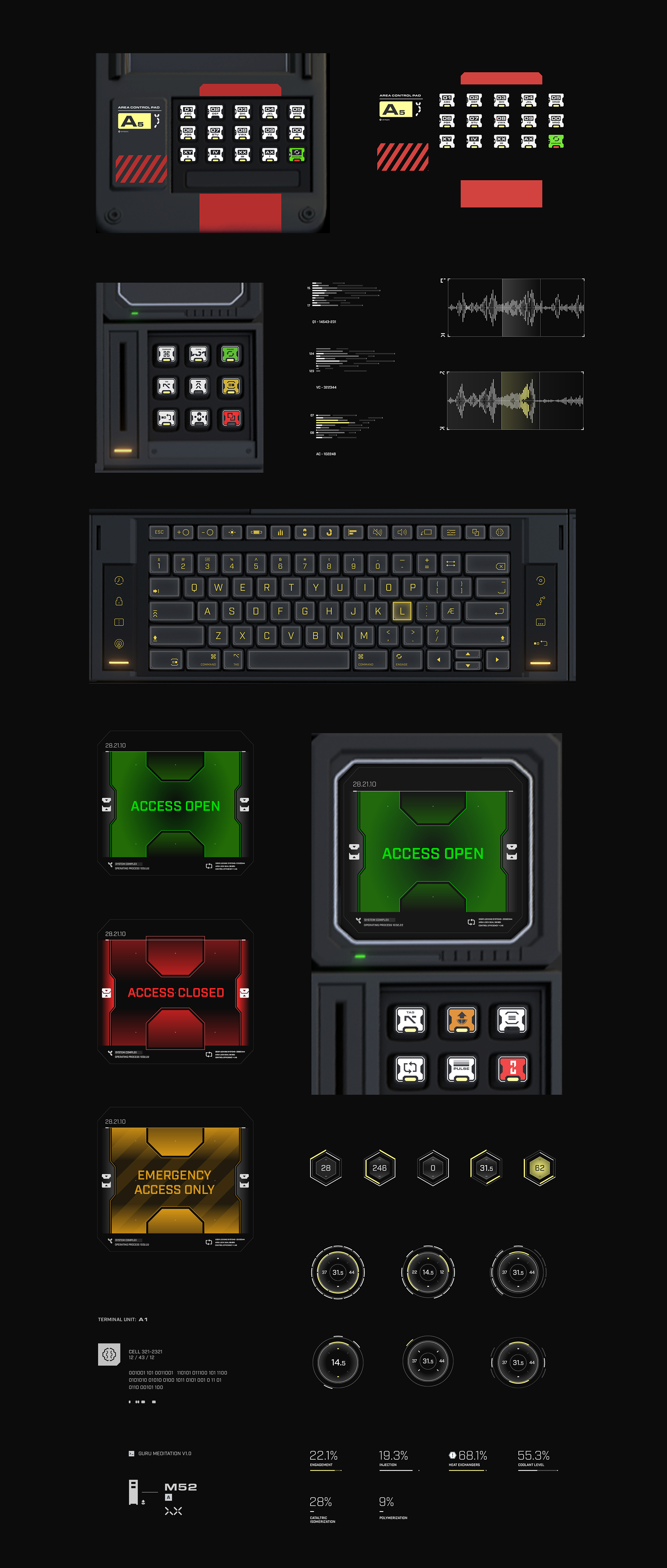
These are some of the graphics I designed for physical controls, keypads and interface screens in collaboration with the environment team. Small touches of function, hierarchy and labelling helped make the world feel futuristic while remaining familiar and believable. After all, Master Chief spends a surprising amount of time flicking switches between bouts of murdering aliens.
The process drew on my fictional user interface work for film, but games introduced an additional challenge. Players could walk right up to everything and inspect it from a first-person perspective, so every element needed to hold up at close range.
I love modern fictional user interface design, but it can quickly begin to follow the same trends and look rather generic. For this type of work, I try to avoid simply repeating the current visual language. Instead, I looked back to older science-fiction films, industrial control systems and analogue product design to give the interfaces a more distinctive and physical quality.
The process drew on my fictional user interface work for film, but games introduced an additional challenge. Players could walk right up to everything and inspect it from a first-person perspective, so every element needed to hold up at close range.
I love modern fictional user interface design, but it can quickly begin to follow the same trends and look rather generic. For this type of work, I try to avoid simply repeating the current visual language. Instead, I looked back to older science-fiction films, industrial control systems and analogue product design to give the interfaces a more distinctive and physical quality.
Environment Decals
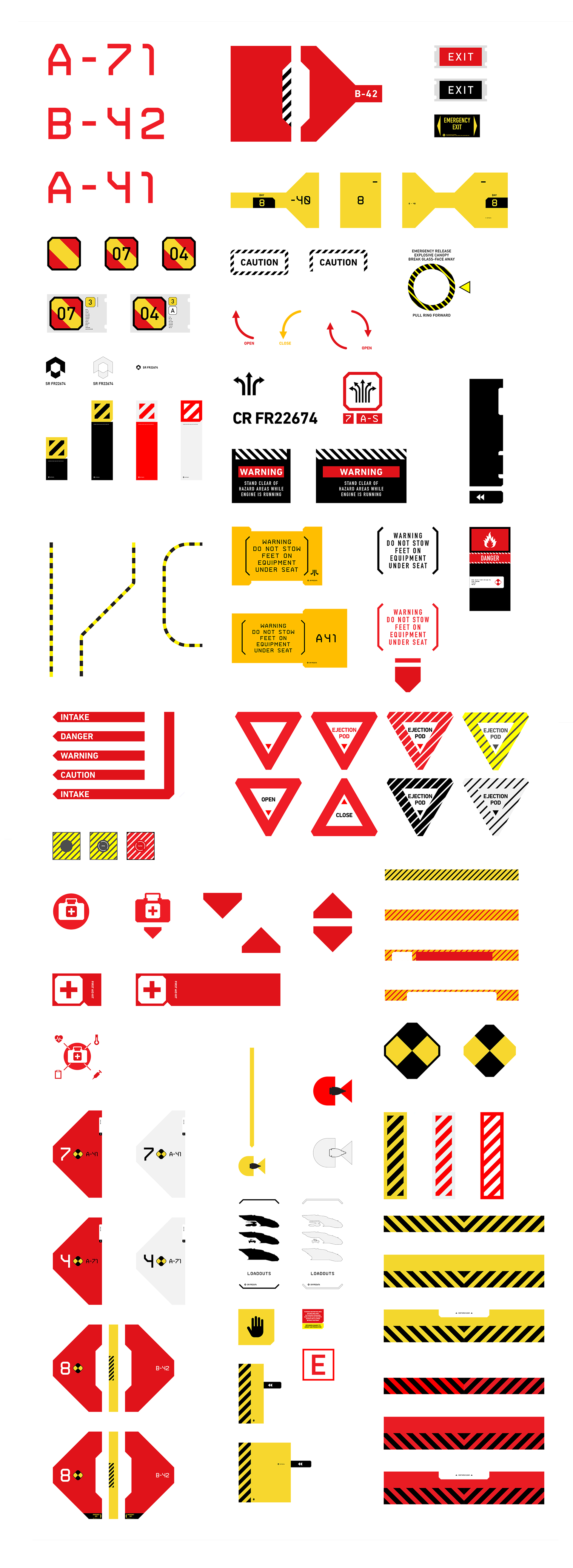
This is a selection of the world-building decals created for the game. Halo exists within a science-fiction fantasy universe, but its environments still need the visual density and accumulated logic of real places. The world needs depth and cohesion.
Each sheet explored a particular theme and provided the environment artists with a practical kit of parts rather than a collection of isolated graphics. The layouts intentionally referenced model kit transfer sheets, reinforcing the sense that these markings belonged to functional objects and spaces.
I was travelling frequently at the time and found particularly strong reference material in airports abroad. Functional typography, safety markings, maintenance labels, operational graphics and wayfinding systems all fed into the final work.
Each sheet explored a particular theme and provided the environment artists with a practical kit of parts rather than a collection of isolated graphics. The layouts intentionally referenced model kit transfer sheets, reinforcing the sense that these markings belonged to functional objects and spaces.
I was travelling frequently at the time and found particularly strong reference material in airports abroad. Functional typography, safety markings, maintenance labels, operational graphics and wayfinding systems all fed into the final work.
Credits
Thanks to the teams at 343 Industries and Microsoft for the opportunity and collaboration. I am proud to have contributed to this chapter of Halo and interested to see where they take the universe next.