My Mission
Fast forward 35 years and I’m stuck at home during the Covid lockdown. I’d rinsed Netflix, dabbled in day drinking, and was hunting for something new to do.
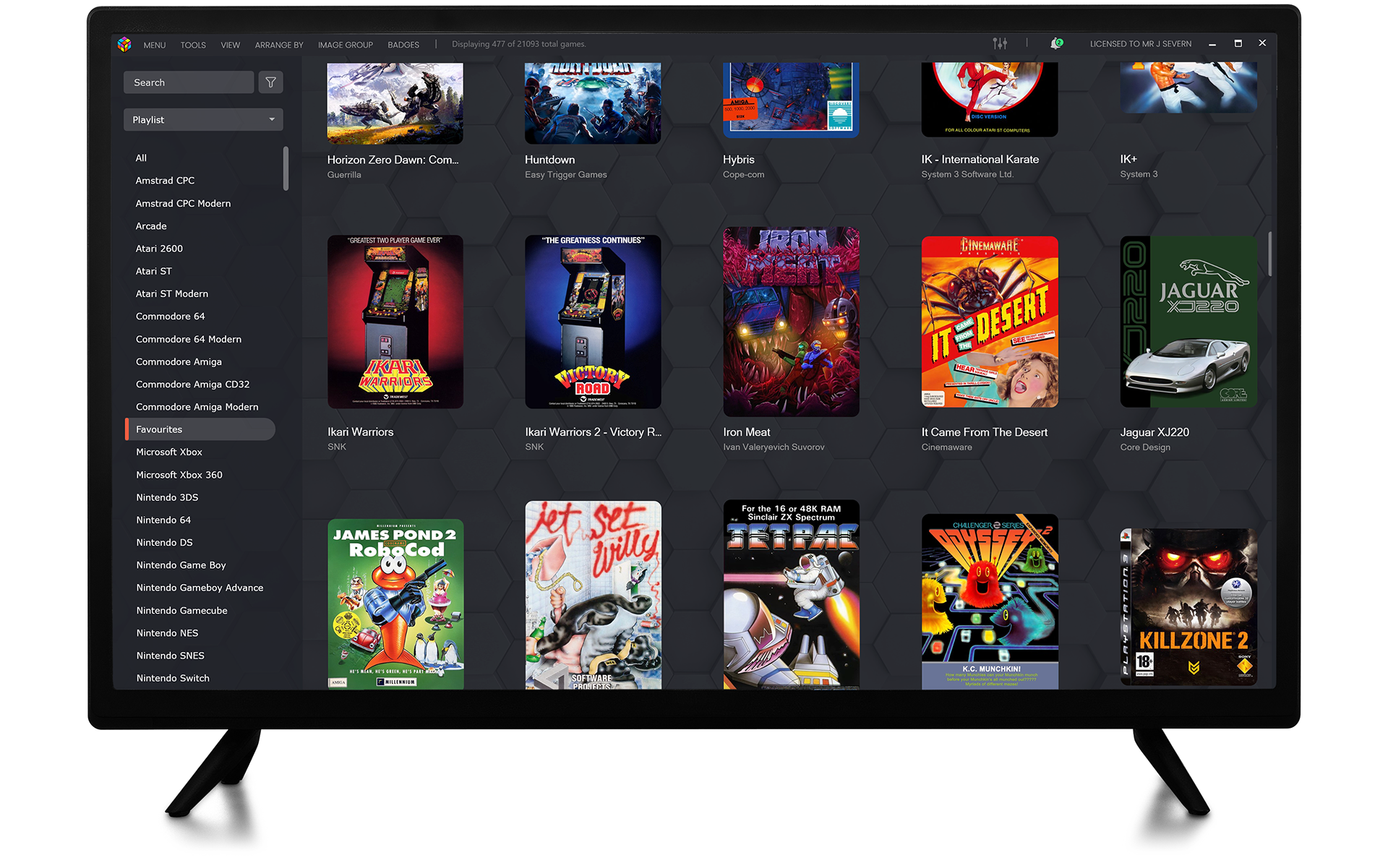
That’s when I found LaunchBox, a brilliant front-end for new and old video games. It pulls in box art, logos, and screenshots from a user-generated database to make any digital collection look amazing. The software kept evolving and was becoming seriously slick.
But there was a problem. Most of the artwork for old computers and consoles looked rough — faded scans, low-res images, poorly captured details.
That was the spark for this project: restoring and reworking classic video game box art so it looks the way it did on release day. I also believe video games are an important part of our culture, and by doing this I’m helping preserve them long after the physical copies have ended up in landfill.
Fast forward 35 years and I’m stuck at home during the Covid lockdown. I’d rinsed Netflix, dabbled in day drinking, and was hunting for something new to do.
That’s when I found LaunchBox, a brilliant front-end for new and old video games. It pulls in box art, logos, and screenshots from a user-generated database to make any digital collection look amazing. The software kept evolving and was becoming seriously slick.
But there was a problem. Most of the artwork for old computers and consoles looked rough — faded scans, low-res images, poorly captured details.
That was the spark for this project: restoring and reworking classic video game box art so it looks the way it did on release day. I also believe video games are an important part of our culture, and by doing this I’m helping preserve them long after the physical copies have ended up in landfill.
My Evolving Restoration Process
I have been doing this for years, and my approach has changed a lot as I have picked up new techniques and tools. With AI upscaling improving rapidly, the process has evolved into something much sharper.
Early Days
Find the best scans of a box, or scan or photograph it myself. I have a large collection to work from.
Having the real box to hand is ideal.
In Photoshop I would:
• Straighten the box.
• Fix the aspect ratio.
• Remove blemishes and stickers.
• Make sure flat colours were solid, black was 100 percent black, and straight lines were straight
• Replace developer and publisher logos, since these were often the weakest elements.
• Finish with colour correction, ideally using the real box for reference.
The Big Shift
Everything changed when I discovered Gigapixel 8. After some experimenting, I settled on a new system:
• Upscale the best scans to four times their original size.
• Clean the image at that super high resolution, following the steps above.
• Use Photoshop generative fill to replace most of the time I used to spend with the clone tool.
• Down sample to a more manageable file size at the end.
Gigapixel offers different modes for handling photos, illustrations and logos, so I switch settings depending on what I am working with. Photoshop generative fill also speeds things up when repairing artwork or filling gaps.
There is still plenty of manual editing involved, but the workflow is faster, the results are sharper, and in many cases the restored artwork looks better than the original printed box.
Before Digital: How Print Media and Box Art Were Made in the 1980s
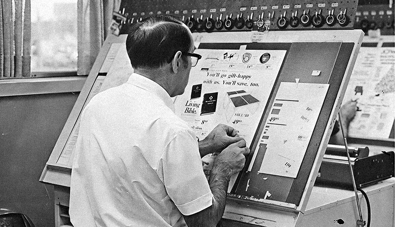
Long before InDesign or Photoshop, publishing was done entirely by hand. Designers sat at large angled desks with scalpels, rulers, Letraset sheets and pots of glue.
Illustrators supplied paintings, often much larger than the final box size. Screenshots were taken by literally photographing a TV or monitor, developed as prints, and cut out. Logos and typography came from phototypesetting houses or Letraset rub down sheets.
All of these elements were physically assembled into what was called a “mechanical” or “paste up.” Pieces were measured, trimmed, and spray mounted onto board, with tape marking out crop lines and bleed areas. The finished board was then sent to the printer, where it was photographed with a process camera to create CMYK film separations.
When I joined the working world in 1998, the small regional advertising magazine I worked at was still using paste up. Most adverts were printed out digitally, then pasted onto boards to build the final pages. It was a kind of half digital process. It probably said more about that company’s failure to fully adopt new technology, but I found it fascinating to see the old craft still alive.
It was painstaking, physical work, and every box, poster and flyer from the era was built this way. That is a big part of why 1980's video game packaging has such a distinct, hand crafted quality, and it is the same care and craft I try to bring back into my restoration work today.
Starting from a Blank Canvas
Illustrations and logos back in the 80s were drawn and painted by hand and usually done by external contractors. Most publishers had a preferred artist, and that person helped establish a company’s identity and brand look. In the early days the artist might be given a verbal brief over the phone, maybe some vague description, and if they were lucky they would see the game or get some visual reference, especially if it was an arcade conversion or licensed title. But for the most part the artist was left to make it up.
What can be hard to grasp now is that they were working from almost nothing. There was no internet for reference and no easy image searches. Inspiration came from whatever books or magazines they had to hand. The artist needed serious creativity and skill to turn a blank sheet into something compelling

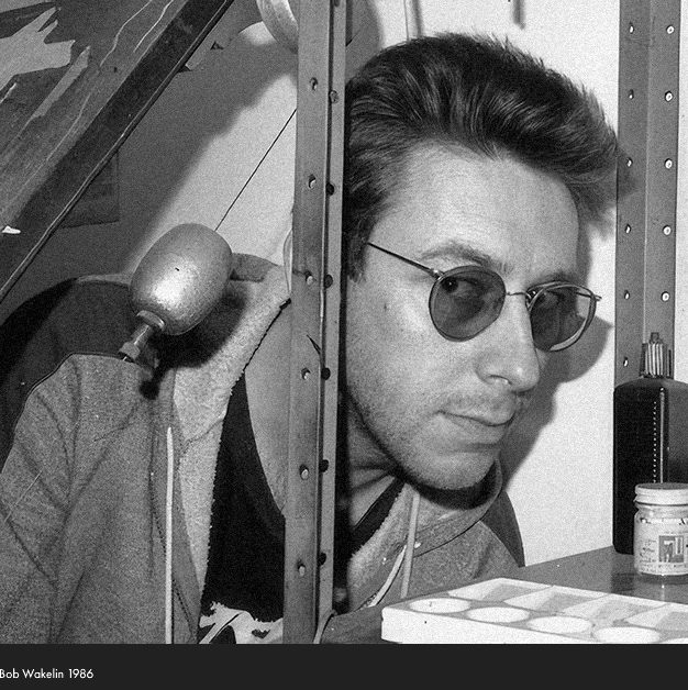
One of the best examples is Bob Wakelin. He was one of Ocean’s and Imagine’s preferred cover artists, responsible for classics such as Robocop, Batman: The Caped Crusader, Gryzor, Green Beret and Wizball. His bold, colour-rich illustrations made these games leap off the shelves. He even designed the iconic Ocean logo, giving the publisher an instantly recognisable identity. Wakelin worked fast, he reportedly produced two or three covers per week for Ocean at certain periods, which is an incredible output given the quality expected.
He could also be very versatile, switching between hyper realistic movie tie-ins and more playful or surreal styles with cartoonish characters. He didn’t stick to one formula, and that kept his work fresh. Some covers he loved making, and some he hated. Operation Wolf was one of his personal favourites, while Parasol Stars and Gift From The Gods were ones he was not keen on.
I met him once, a super nice guy. He said he was not especially interested in games, but he would often drop into a pub to try and find inspiration.
Bob’s last artwork for Ocean was Central Intelligence in 1994. After that he illustrated children’s books and other projects before illness forced him to slow down. Sadly he passed away in January 2018. His contribution to UK video game box art is massive and still widely recognised.
Breaking the Rules with the Advent of the Digital Age
I started my career at an exciting moment. Digital tools had existed for a while, but they were finally transforming the way work was done. The internet was arriving, and the launch of the PlayStation pushed video games firmly into mainstream culture.
Software like FreeHand and Photoshop meant a single graphic designer / artist could handle almost every stage of the design process. Process shapes content, and with old workflows gone, a new wave of designers were free to experiment, cut their own paths and break the rules.
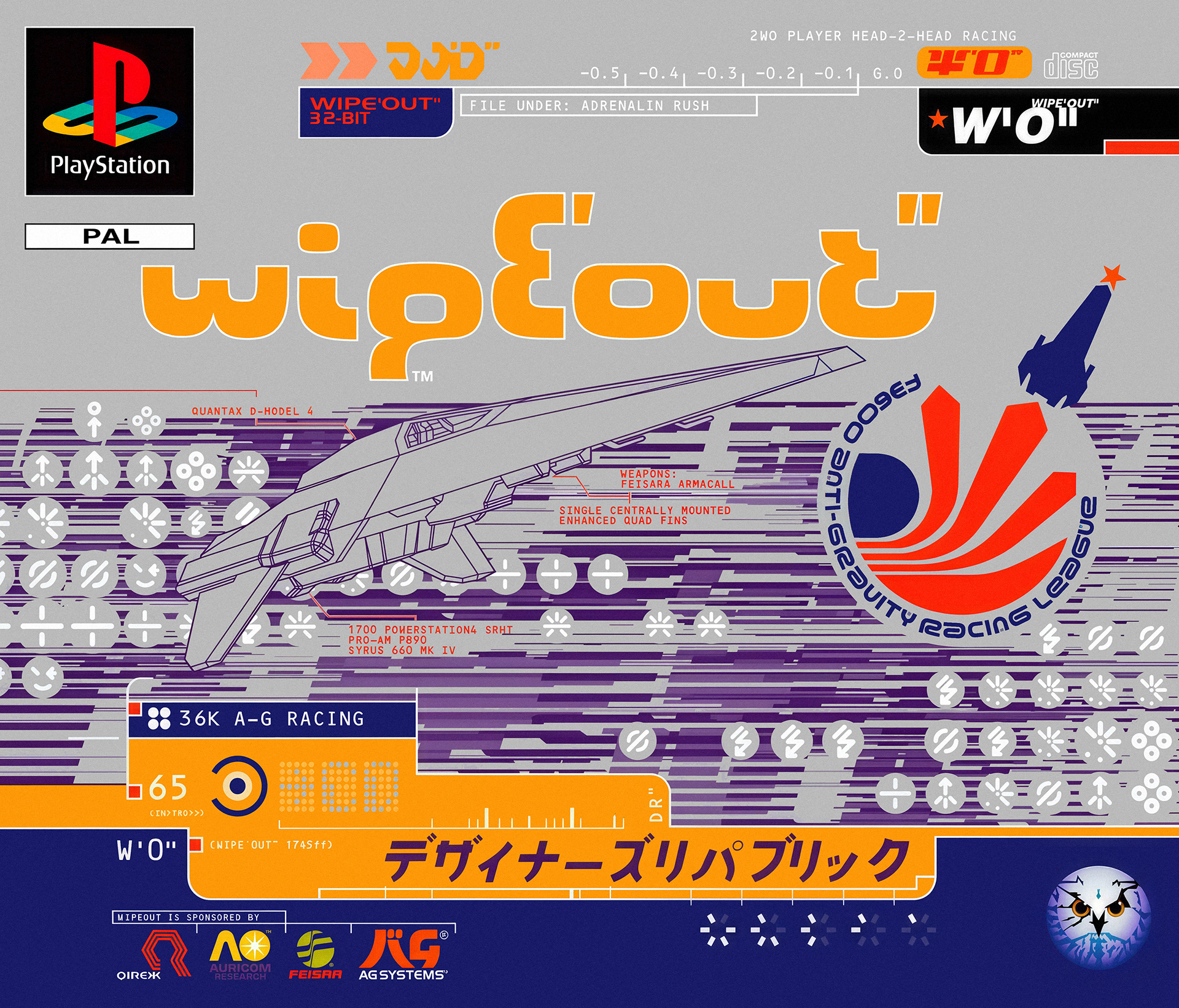
In the UK, studios such as Attik, Tomato and The Designers Republic were leading the way and were regarded among the best in the world. Wipeout landed perfectly in that moment. Sony marketed its new console to a broader audience, borrowing cues from music and film culture.
Wipeout was a futuristic racer with a pounding dance soundtrack. The Designers Republic designed the racing teams, the in-game UI and HUD, and the box art. I remember seeing the box for the first time and not even knowing what I was looking at, only that it was new and cool. I bought the game immediately.
That collaboration helped define the PlayStation as the “cool” console of the 90s, bridging video games, club culture and cutting-edge design.
I started my career at an exciting moment. Digital tools had existed for a while, but they were finally transforming the way work was done. The internet was arriving, and the launch of the PlayStation pushed video games firmly into mainstream culture.
Software like FreeHand and Photoshop meant a single graphic designer / artist could handle almost every stage of the design process. Process shapes content, and with old workflows gone, a new wave of designers were free to experiment, cut their own paths and break the rules.
In the UK, studios such as Attik, Tomato and The Designers Republic were leading the way and were regarded among the best in the world. Wipeout landed perfectly in that moment. Sony marketed its new console to a broader audience, borrowing cues from music and film culture.
Wipeout was a futuristic racer with a pounding dance soundtrack. The Designers Republic designed the racing teams, the in-game UI and HUD, and the box art. I remember seeing the box for the first time and not even knowing what I was looking at, only that it was new and cool. I bought the game immediately.
That collaboration helped define the PlayStation as the “cool” console of the 90s, bridging video games, club culture and cutting-edge design.
This project is about more than nostalgia. Humans tend to chase the next shiny thing while overlooking the past and failing to preserve it for future generations. Techniques and skills are often lost in the noise of the present.
I still remember standing in Tesco and picking up Airwolf on cassette tape as my very first game, drawn in entirely by the cover without knowing what the tape itself would deliver. That artwork lit the spark for me, and restoring it now feels like giving something back. Video game box art is part of our shared culture, as important as the games themselves. By preserving it, I hope to keep that history alive long after the physical boxes and tapes have disappeared.
I still remember standing in Tesco and picking up Airwolf on cassette tape as my very first game, drawn in entirely by the cover without knowing what the tape itself would deliver. That artwork lit the spark for me, and restoring it now feels like giving something back. Video game box art is part of our shared culture, as important as the games themselves. By preserving it, I hope to keep that history alive long after the physical boxes and tapes have disappeared.
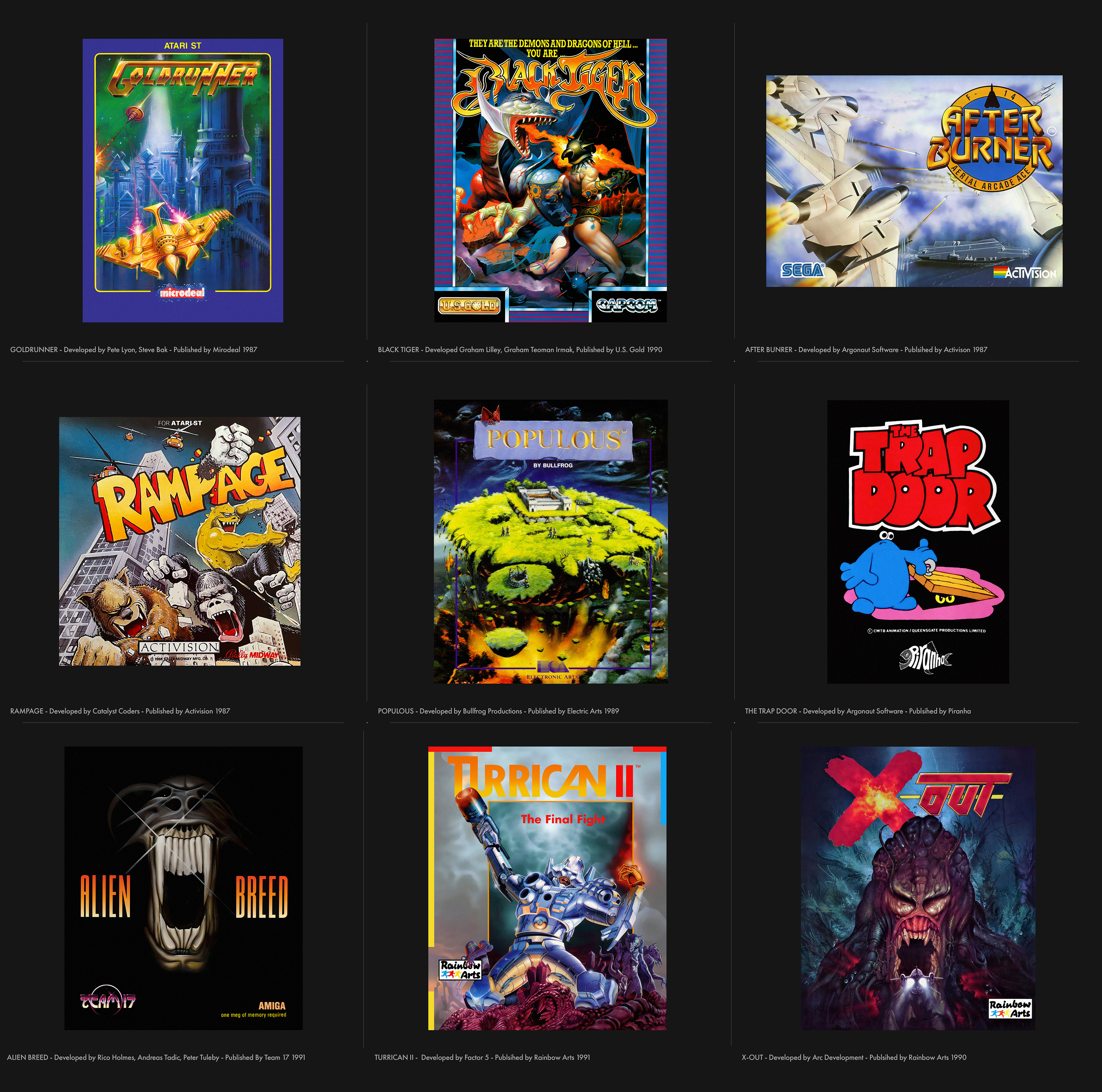
Artist Credits
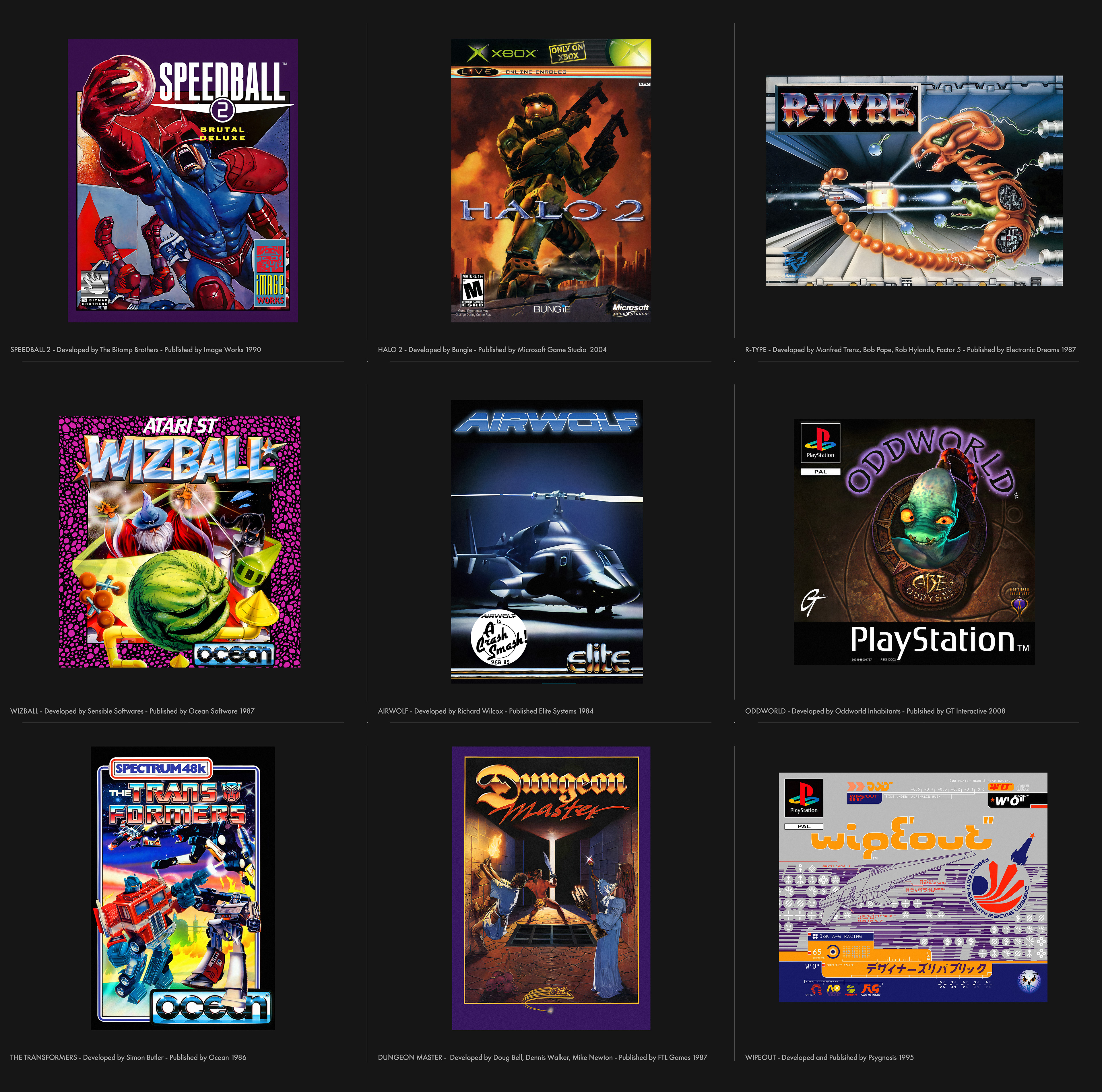
Wipeout : Designers Republic
Halo 2 : Craig Mullins
Renegade, Wizball, Green Beret, Batman Caped Crusader : Bob Wakelin
Project X, Populous, : Robert Florczak
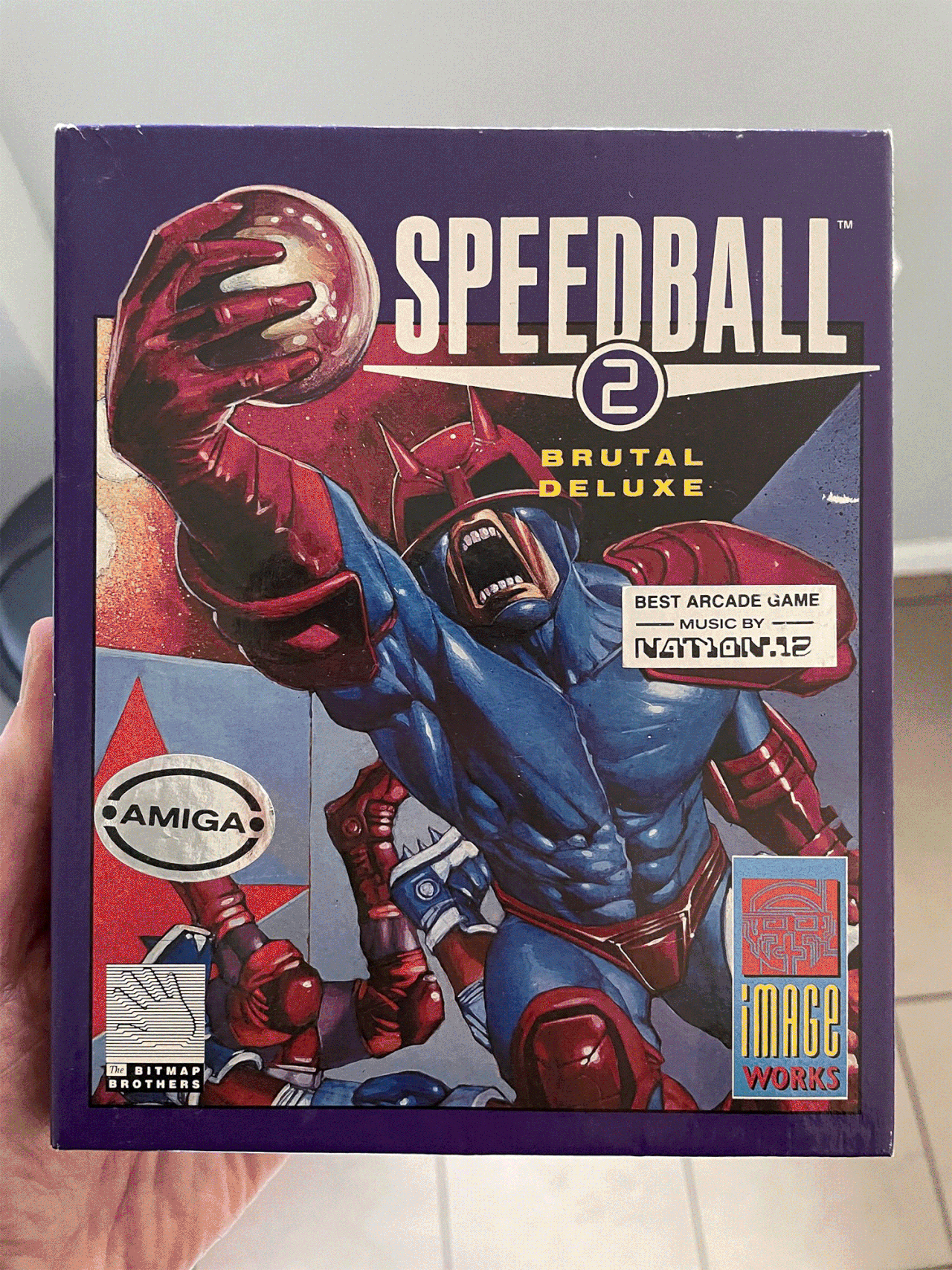
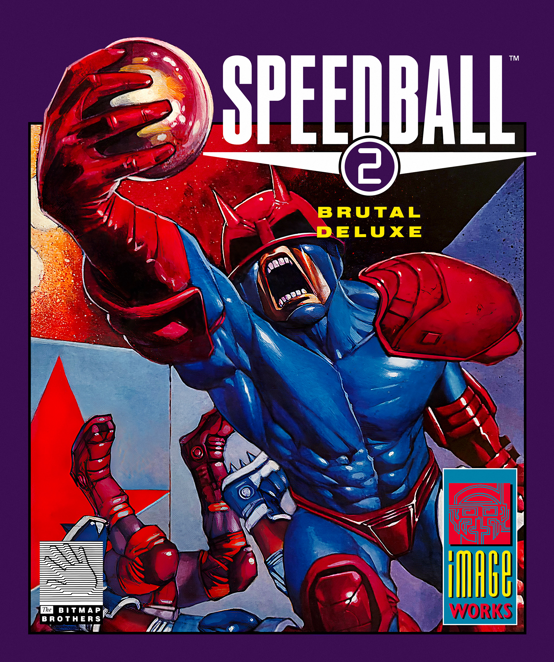
Speedball 2 : Glenn Fabry
R-Type : Bob Pape
Oddworld: Abe's Oddysee : Oddworld Inhabitants
Dungeon Master : David R. Darrow
Black Tiger : Peter Andrew Jones
After Burner : Focus Creative Enterprises Ltd
Alien Breed : Rico Holmes
Turrican II, X-Out : Celal Kandemiroglu
Defender of the Crown : Peter Green
Golden Axe : Dermot Power
North & South : Shintaku Kiminari Sueda
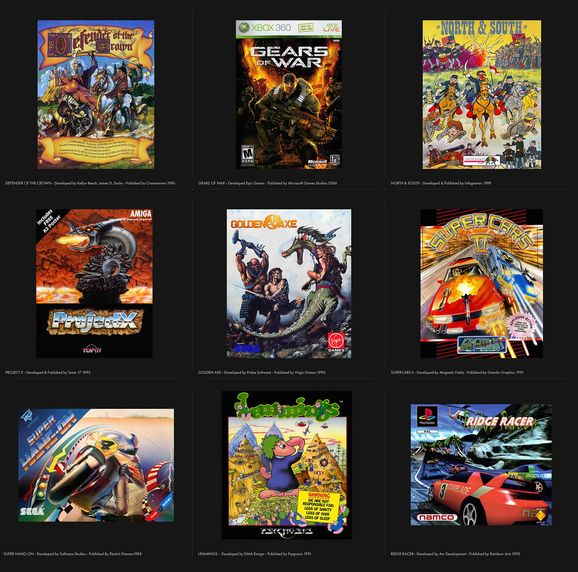
Gears of War : Epic Games
Lemmings : Roger Dean
Ridge Racer : Namco